5 Ways to Improve Your Marketing Design Using Psychology
From repeating visual elements to taking a minimalist approach, here are a few ways you can design for your customers’ subconscious preferences.
Improve Your Marketing Design Using Psychology
Nowadays, graphic design has become a valuable digital marketing pillar. Graphic design enhances your marketing deliverables across all online communication channels, whether it’s to create an engaging website, eye-popping email campaign, outstanding PowerPoint presentation or viral social media campaign. Well-crafted visuals optimize the experience between the customer and the brand, strengthening relationships, generating recognition and boosting sales.
The key to amazing marketing design? Create the way people think. Mixing the right colors or photos isn’t enough, you need to understand what motivates the buyer’s behavior to convert. It’s crucial to focus your initial research on the idea that all actions, feelings, thoughts, even consciousness itself, are just the products of neural activity in the brain. If you have a total comprehension of the human brain, you can increase your sales exponentially.
Let’s explore five guiding principles on how you can use psychology to improve your graphic design assets.

1. Minimalist Graphic Design Focuses Users on What Really Matters
Digital marketing is based on clear concise writing and minimalist design. As the famous designer Massimo Vignelli, known for creating the subway map of the city of New York, the Bodoni type font, all the Bloomingdale’s packaging and the American Airlines logo, used to say: “Minimalism is not a style, it is an attitude, a way of being. It’s a fundamental reaction against noise, visual noise, disorder and vulgarity.”
Minimalism might feel like just another fad, but it’s one that has some unexpected benefits. It can actually benefit mental health because its emphasis on ‘less’ can give the human brain a bit of a break.
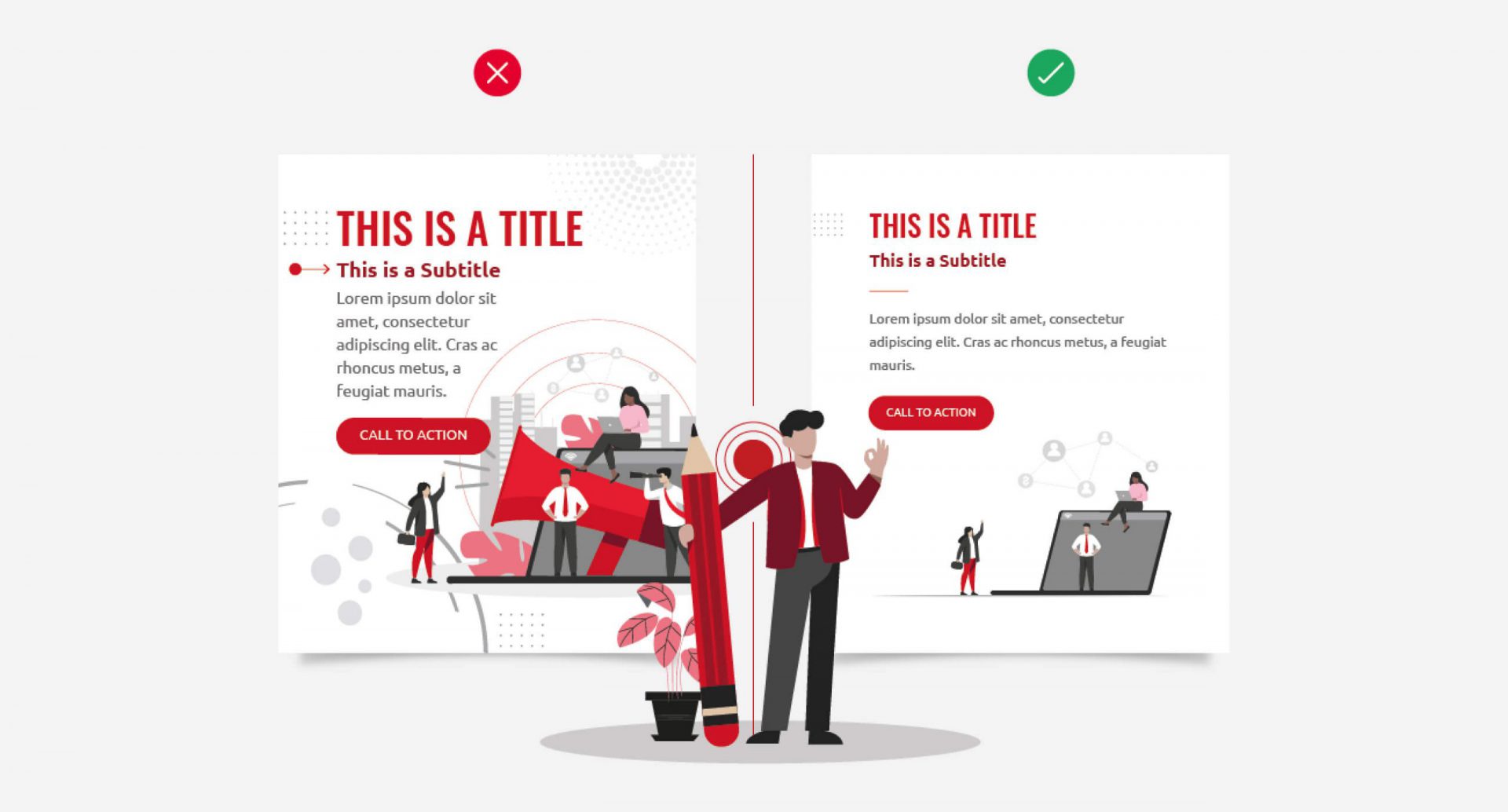
Minimalist design and its principles (repetition, formal simplicity and the use of voids) should be taken as the first option when you are designing all the marketing assets destined to sell your products and/or services.
Here are a few ways to embrace a minimalist marketing design approach:
- Repetition: Limit the variation of your design elements
- Formal simplicity: Try to only use perfect geometric shapes and uninterrupted lines
- Use of voids: Leave empty white space to enhance the elements in your design

2. Group Your Design Elements to Improve Customer Engagement
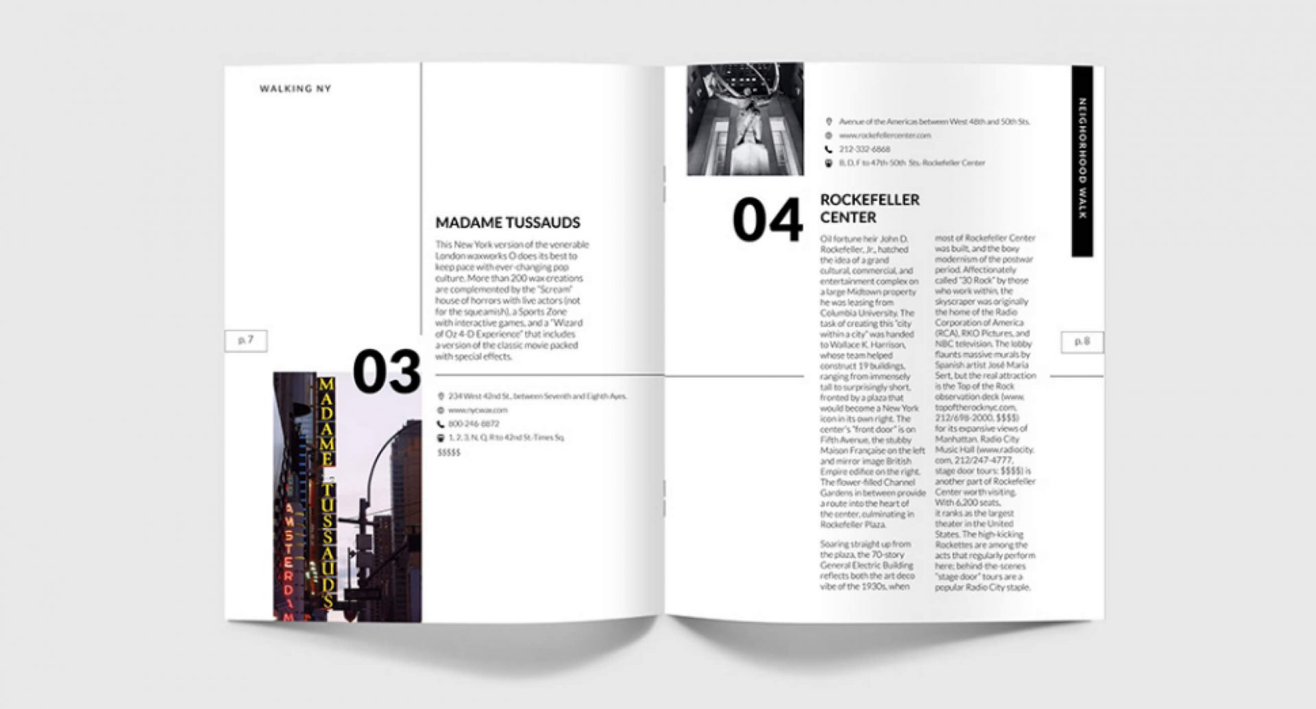
Proximity gives a visual indication of what information is related without putting too much effort on your audience. The reality is most of your viewers will scan your content — they don’t read every single section of copy placed in front of them — so your design shouldn’t have too many things vying for their attention.
By grouping elements together, related digital design content becomes significantly easier to take in.
For example, the list on the left has no kind of categorization; everything has the same spacing and there is no visual indication of what’s related and what’s not. Meanwhile, the list on the right incorporates this design practice and is therefore much more manageable. One of the biggest mistakes that people make when they’re creating text is not using precise spacing and perfect categorization.

3. Build A Strong Visual Connection Between Your Design Elements
Alignment helps the eyes send messages to the brain to form a visual connection between the information in front of you and its space disposition. This gives the eyes a soft edge to follow. The strength of the alignment is what gives strength to your whole layout, making it feel more cohesive.
According to Brian Cugelman, renouned digital behavioral scientist, if you want to improve your sales and engagement by getting better clients to your business, using the princepals of psychology and neuroscience in your graphic design is your answer.

How much better does this example look when the designer pushes everything over to the right using bullet points? It’s so much easier to read because it lets the eyes do what they’re going to do naturally. By embracing the principle of alignment, the information does not feel overwhelmed because all the elements are breathing well.

4. Improve Your Graphic Design Through Visual Repetition
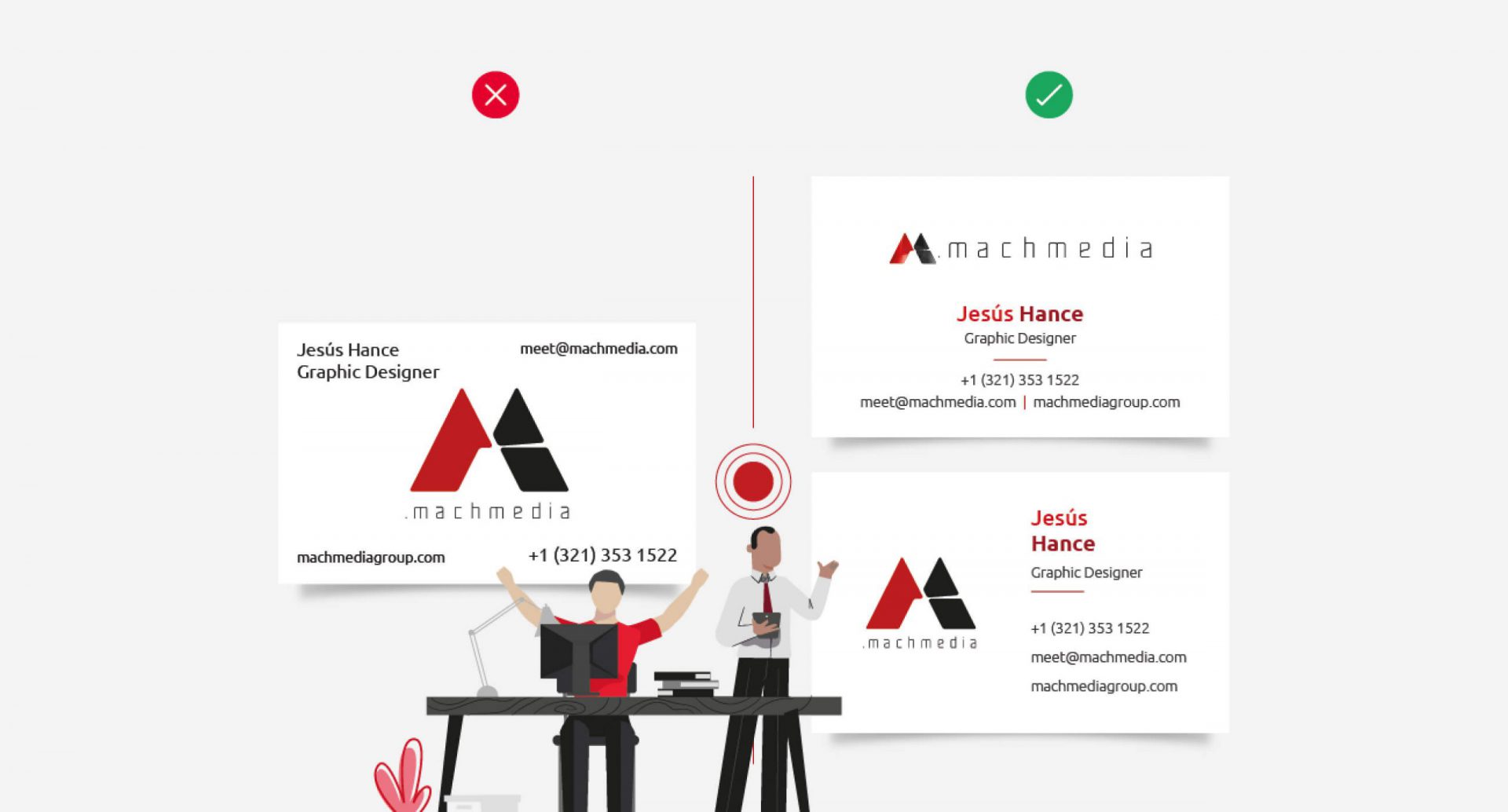
The theory of repetition is simple and powerful. Pick visual elements from your design and use them throughout the piece. This makes each element look like it’s related to the others, giving the overall design a more cohesive feel.
Proper repetition can be done by taking key brand and marketing design elements, like colors, fonts, lines, shapes, sizes and texture, among others, and incorporating them throughout your piece.
Fundamentally, this theory is based on the searching of visual rhythm, creating a feeling of movement. Though the size, shape, color or even spaces are not particularly the exact same as each other, rhythm still gives a particular design uniformity and a seamless flow.

With so much marketing content crowding the internet, the demand for fresh and innovative ideas to augment visual B2B communications is rising. Truly connecting with your audience on a psychological level can help you bring your brand messaging to life, create dynamic marketing and design with purpose.
Need help connecting with your audience or even help to better understand them in the first place? Mach Media’s got you covered. From the beginning stages of customer journey planning, all the way through to content execution, Mach Media is here to help your brand succeed!
Looking for more marketing expertise?
Sign up for our newsletter
"(Required)" indicates required fields
YOU MAY ALSO LIKE…

How to add Video to your Digital Marketing Strategy
Digital marketing without video has become unthinkable. Now more than ever, marketers are using video to get their message across.
Read more
