8 Guidelines for Designing Accessible Presentations
Creating an inclusive work environment is ensuring your presentations are accessible for everyone. Follow our 8 guidelines to designing accessible presentations.
One of the most vital tools in the modern workplace is PowerPoint. However, they aren’t always accessible for everyone, which can make your materials exclusionary and can create an inequitable environment.
Mach Media has always made a sincere commitment to Diversity, Equity, and Inclusion (DEI). In our industry of marketing and communication, there are countless areas where these values need to be upheld.
PowerPoint Accessibility Guidelines
So, to help you foster inclusion in your workplace, we’ve put together a checklist to ensure your PowerPoints are as inclusive as possible:
- Create screen reader compatible custom templates.
- Add Alt-text and image descriptions for any charts, graphs, icons, images, pictures, shapes, or other media. Alt-text and image description are what screen readers use to describe pictures.
- Group layered images into single objects to create simplicity.
- Avoid excess animation. Your viewers may be sensitive to moving or flashing images. Strobing or rapidly moving images should be avoided, as this can make certain viewers sick or cause a seizure.
- Use high contrast color schemes to make your assets easier to read.
- Use solid backgrounds with a contrasting text color. If using a white background, use a color slightly off-white. These are more accessible for people with perceptual differences, such as dyslexia.
- Design slides to be accessible for people with dyslexia. Use simple fonts with adequate spacing between letters and use at least an 18-point font size. Avoid compressed fonts, fonts with uneven line weights, fancy/script/display fonts and italic or underlined fonts.
- Apply the “6 by 7” rule: only 6 words per line and 7 lines per slide to keep your text easily readable. Be sure to leave plenty of space above and below each line.
While this checklist can’t guarantee the inclusion of everyone, it is certainly a good start and worth the extra effort. For more checklists and DEI tips, check these out:
Looking for more marketing expertise?
Sign up for our newsletter
"(Required)" indicates required fields
YOU MAY ALSO LIKE…

How to add Video to your Digital Marketing Strategy
Digital marketing without video has become unthinkable. Now more than ever, marketers are using video to get their message across.
Read more5 Ways to Improve Your Marketing Design Using Psychology
From repeating visual elements to taking a minimalist approach, here are a few ways you can design for your customers’ subconscious preferences.
Improve Your Marketing Design Using Psychology
Nowadays, graphic design has become a valuable digital marketing pillar. Graphic design enhances your marketing deliverables across all online communication channels, whether it’s to create an engaging website, eye-popping email campaign, outstanding PowerPoint presentation or viral social media campaign. Well-crafted visuals optimize the experience between the customer and the brand, strengthening relationships, generating recognition and boosting sales.
The key to amazing marketing design? Create the way people think. Mixing the right colors or photos isn’t enough, you need to understand what motivates the buyer’s behavior to convert. It’s crucial to focus your initial research on the idea that all actions, feelings, thoughts, even consciousness itself, are just the products of neural activity in the brain. If you have a total comprehension of the human brain, you can increase your sales exponentially.
Let’s explore five guiding principles on how you can use psychology to improve your graphic design assets.

1. Minimalist Graphic Design Focuses Users on What Really Matters
Digital marketing is based on clear concise writing and minimalist design. As the famous designer Massimo Vignelli, known for creating the subway map of the city of New York, the Bodoni type font, all the Bloomingdale’s packaging and the American Airlines logo, used to say: “Minimalism is not a style, it is an attitude, a way of being. It’s a fundamental reaction against noise, visual noise, disorder and vulgarity.”
Minimalism might feel like just another fad, but it’s one that has some unexpected benefits. It can actually benefit mental health because its emphasis on ‘less’ can give the human brain a bit of a break.
Minimalist design and its principles (repetition, formal simplicity and the use of voids) should be taken as the first option when you are designing all the marketing assets destined to sell your products and/or services.
Here are a few ways to embrace a minimalist marketing design approach:
- Repetition: Limit the variation of your design elements
- Formal simplicity: Try to only use perfect geometric shapes and uninterrupted lines
- Use of voids: Leave empty white space to enhance the elements in your design
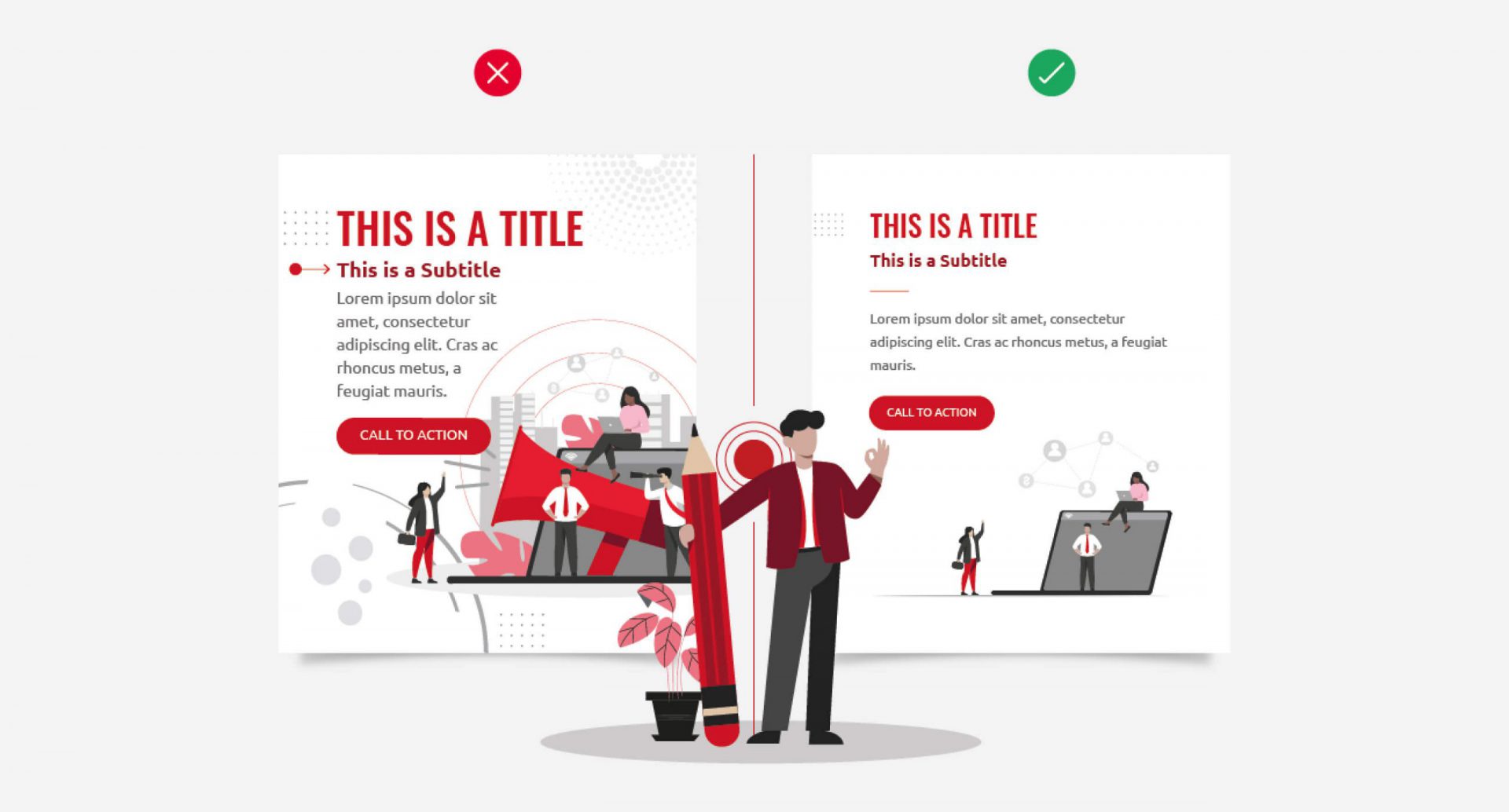
2. Group Your Design Elements to Improve Customer Engagement
Proximity gives a visual indication of what information is related without putting too much effort on your audience. The reality is most of your viewers will scan your content — they don’t read every single section of copy placed in front of them — so your design shouldn’t have too many things vying for their attention.
By grouping elements together, related digital design content becomes significantly easier to take in.
For example, the list on the left has no kind of categorization; everything has the same spacing and there is no visual indication of what’s related and what’s not. Meanwhile, the list on the right incorporates this design practice and is therefore much more manageable. One of the biggest mistakes that people make when they’re creating text is not using precise spacing and perfect categorization.
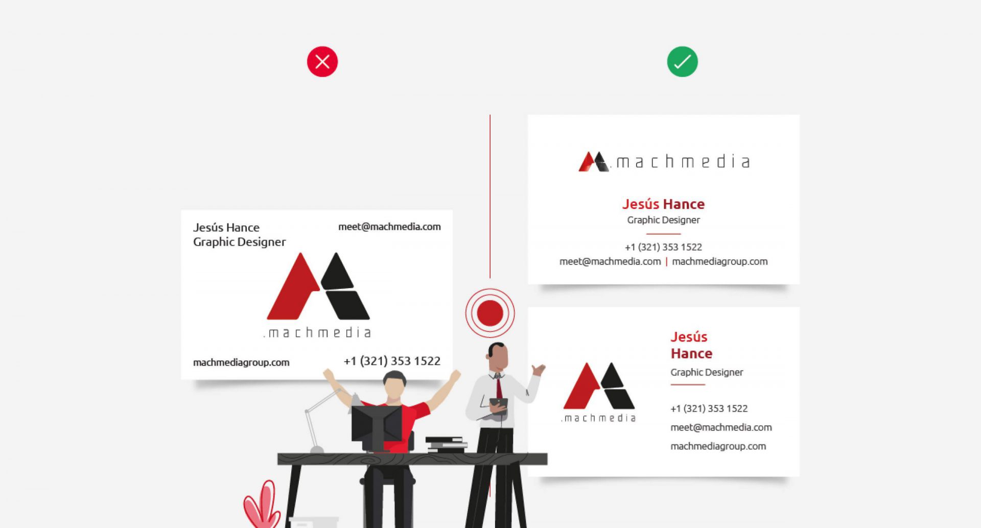
3. Build A Strong Visual Connection Between Your Design Elements
Alignment helps the eyes send messages to the brain to form a visual connection between the information in front of you and its space disposition. This gives the eyes a soft edge to follow. The strength of the alignment is what gives strength to your whole layout, making it feel more cohesive.
According to Brian Cugelman, renouned digital behavioral scientist, if you want to improve your sales and engagement by getting better clients to your business, using the princepals of psychology and neuroscience in your graphic design is your answer.

How much better does this example look when the designer pushes everything over to the right using bullet points? It’s so much easier to read because it lets the eyes do what they’re going to do naturally. By embracing the principle of alignment, the information does not feel overwhelmed because all the elements are breathing well.
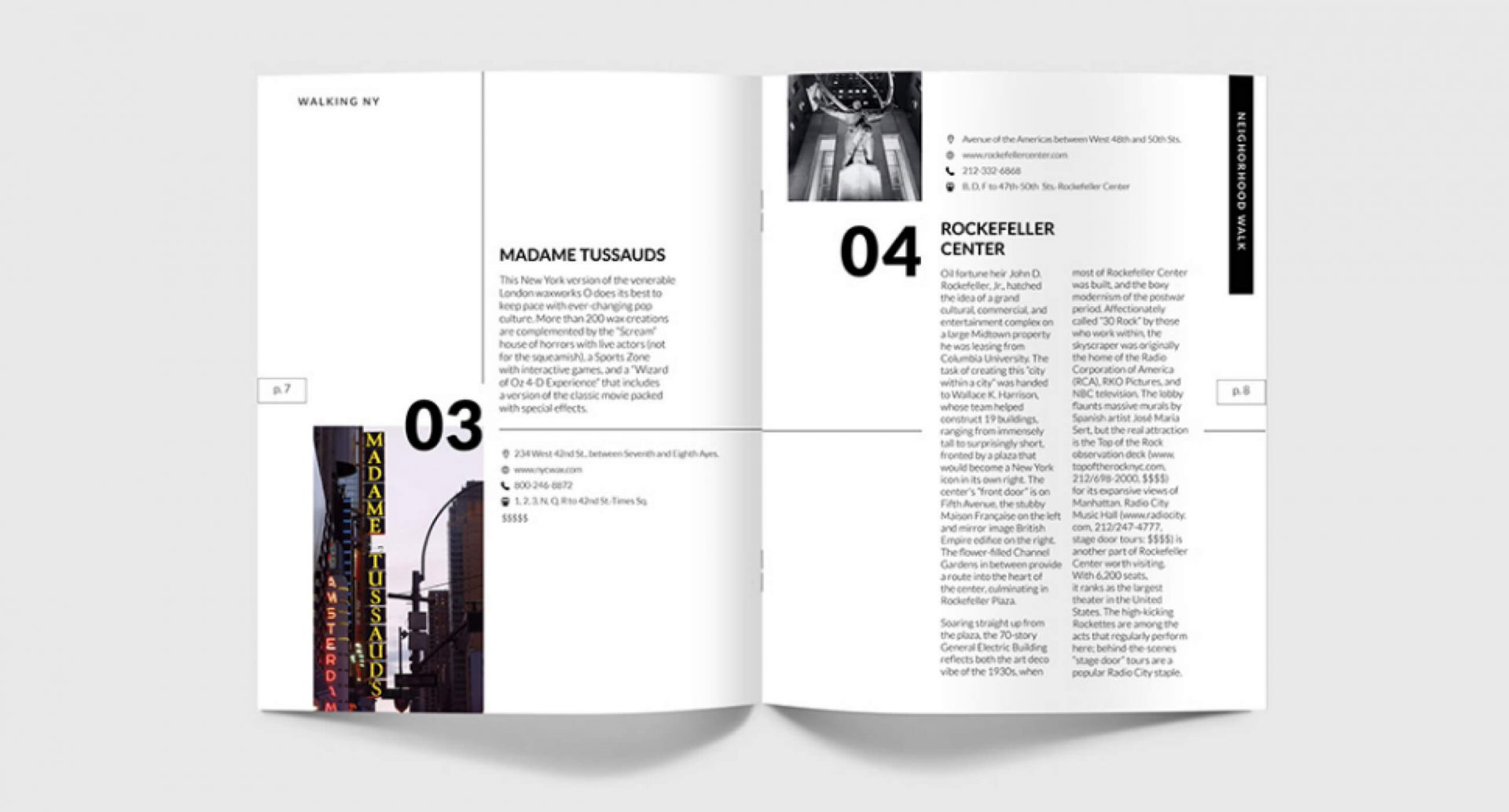
4. Improve Your Graphic Design Through Visual Repetition
The theory of repetition is simple and powerful. Pick visual elements from your design and use them throughout the piece. This makes each element look like it’s related to the others, giving the overall design a more cohesive feel.
Proper repetition can be done by taking key brand and marketing design elements, like colors, fonts, lines, shapes, sizes and texture, among others, and incorporating them throughout your piece.
Fundamentally, this theory is based on the searching of visual rhythm, creating a feeling of movement. Though the size, shape, color or even spaces are not particularly the exact same as each other, rhythm still gives a particular design uniformity and a seamless flow.
With so much marketing content crowding the internet, the demand for fresh and innovative ideas to augment visual B2B communications is rising. Truly connecting with your audience on a psychological level can help you bring your brand messaging to life, create dynamic marketing and design with purpose.
Need help connecting with your audience or even help to better understand them in the first place? Mach Media’s got you covered. From the beginning stages of customer journey planning, all the way through to content execution, Mach Media is here to help your brand succeed!
Looking for more marketing expertise?
Sign up for our newsletter
"(Required)" indicates required fields
YOU MAY ALSO LIKE…

How to add Video to your Digital Marketing Strategy
Digital marketing without video has become unthinkable. Now more than ever, marketers are using video to get their message across.
Read moreGraphic Design Trends To look out For
As we are approaching the halfway mark into 2021, it’s worth a moment to stop and smell the roses. Let’s take inventory to see where we’re at in the vast world of B2B communication design, especially with its trends that come and go throughout the year.
2020 was something special for all of us, to say the least. There is no denying that all the recent chaos has had an impact on design trends that were predicted at the start of this year. We’ll have a closer look at some, to see if we can figure out the fainting fads from those that are here to stick around for just a little longer.
Marketing Through Socially Conscious Graphic Design
Social unrest stemming from ever-growing inequality, unfair and unjust treatment of minority communities and general closed-mindedness overall are driving the need for companies to take a stance on socio-political issues. Rather than being a visual trend, this is more of a mindset change that has translated into more inclusive design and imagery. This means we’re seeing a lot more representation when it comes to ethnicity, gender, sexual orientation, body type, physical or mental limitations, age and socioeconomic status.

Resource suppliers like Unsplash and Pexels are great examples of how typical polished stock model photography is making way for more realistic human representation, embracing all of our differences, strengths and imperfections.
This is a trend that isn’t going anywhere and for good reason; it is up to marketeers and designers alike to create graphic design content that connects to its audiences on a deeper level and the only way to do that properly is to be inclusive.
B2B Clients Demand Sustainable Graphic Design

With the ongoing pressure over the current climate crisis and the increasingly severe problems we’re all facing because of it, more and more companies are setting concrete goals and actionable promises toward sustainable manufacturing and production.
Just like how compostable consumer goods packaging and eco-friendly labels are no longer exclusively for bioproducts, neither are sustainable design trends solely limited to “Save the whale” initiatives.
We all share a responsibility, and our designs have a huge impact on how these initiatives are being perceived. The Sustainable Development Goals initiative acts as a major contributor to these efforts and their rather simplistic and straightforward branding seems to favor, or at least integrates more easily, with a playful “naïvely crafted” style. This trend attempts to bring us closer to nature through designs that are more organic and evoke a sense of natural simplicity, bringing design back to its roots of being a tactile handcraft.
Next Level 3D in B2B Marketing
This isn’t so much a current trend, as the integration of three-dimensional graphics has been part of many a graphic designer’s portfolio for a fairly long time now, but ongoing technological advancements in graphics processing units have definitely facilitated the way 3D graphics can be created.
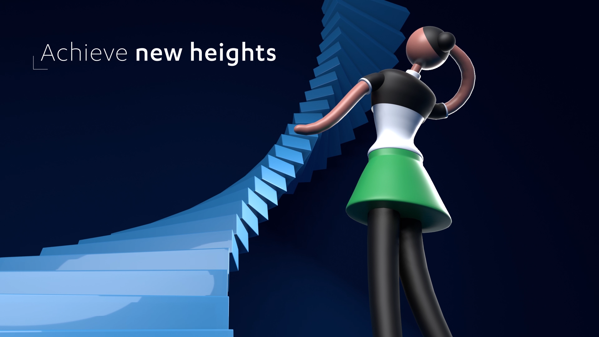
Add to that an ever-growing array of 3D applications, some even completely free, like Blender, and that infamously steep learning curve that frightened so many designers in the past seems to finally be flattening. Upcoming design tool Spline boasts about empowering the creation and publishing of 3D content online with ease, but the tool is seemingly still at a rather early stage in development. In addition to this, Adobe Aero promises to create augmented reality experiences without the need for complex coding, so it is worth keeping an eye on the public beta.
Flat Graphic Design 2.0
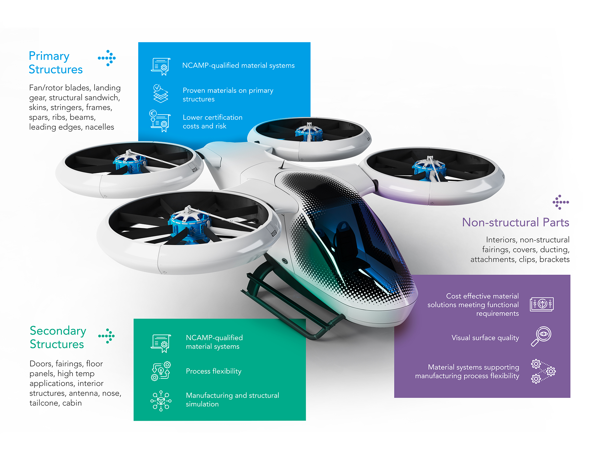
Even with 3D applications gaining substantial ground each year in our arsenal of tools, the flat trend is still here to stay. Flat design gained popularity rapidly when UI designers started switching to simplified visuals that broke with the skeuomorphism trend that mimicked real-life buttons and switches. Pretty much the entirety of the graphic design world followed suit overnight.

Graphic designers seem to constantly be on the lookout for new ways to add back some form of visual complexity to flat design, while still trying to maintain the charm and straightforwardness that makes it so effective. This can often be done by adding subtle textures or selective shadows and highlights or by integrating flat design elements with photos shot with dramatic perspective.

Pixels Turn to Voxels
Pixel art came back to life around 2015, after having laid dormant since the early nineties and it has been an ongoing staple of retro style design since then. With the surge of isometric design a few years later and the huge boom in voxel (volumetric pixel) graphics like those from the Minecraft universe and countless mobile apps, corporate comms designers are pushing old-school pixel art into the 3D realm.

Most isometric graphics in today’s corporate communications are found in infographics. The added dimension is a welcome evolution from flat design, which has been dominating this medium for a long time.
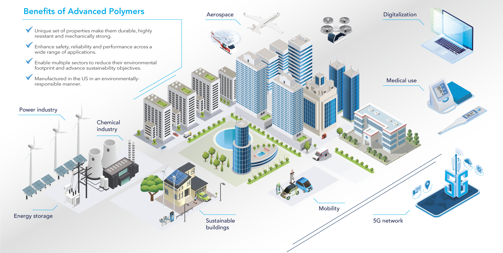
They add an extra level of depth on your plane to work with and have the benefit of not distorting due to perspective (the foreshortening of the axes is equal), as is the case with “real” 3D graphics. This creates picture-perfect graphics that work well with the usually more formal characteristics of corporate infographics.
Incorporate Blurs and Blends in Your Visual Marketing
Glass UI started showing itself in continuation of neomorphism. This in itself was an answer to skeuomorphic design, which dominated UI back when iPhones were still novel. This trend blends colors and layers through subtle blurs and layering, mimicking overlapping layers of milk glass.
Skeuomorphic design attempted to bridge the transition going from pressing physical buttons to interacting with touch screen objects that relied on taps, pinches and swipes instead. By the time most people had adapted and gotten used to these non-mechanical interactions, there was room to simplify (enter flat design). While isometric and 3D reintroduce us to depth, blurring and blending elements also
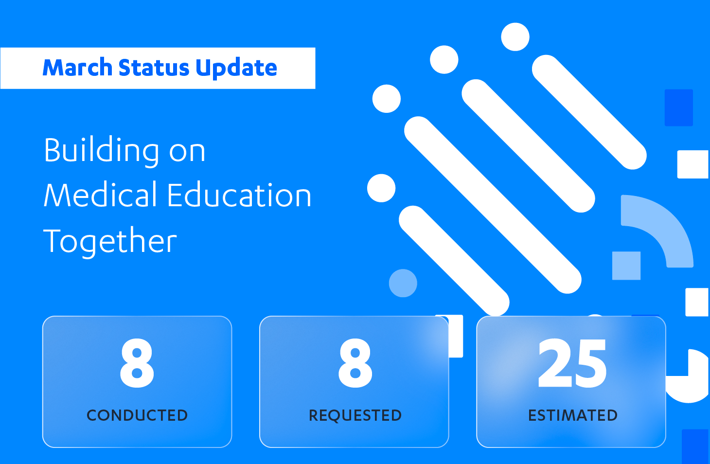
help create layered designs that allow for more nuanced transitions and integration of elements. The main difference with this trend, however, is that flat elements can still largely be present, in addition to the additional layers blurring and blending brings in to soften contrast and harmonizing elements.

Making Your Marketing Designs Shiny and New
As is the case with most trends, as soon as they are established as a trend, they start to lose relevance. Following trends can keep you from creating innovative designs but ignoring them can just as easily brand your work as outdated. As with most things, balance is key.
Expectations are rightfully becoming increasingly more demanding of innovative and fresh ideas to augment visual B2B communications. It’s not surprising that many clients will often hint toward a specific trendy style they want their agency to include in their work. However, if you choose to blindly follow suit you may find yourself pumping out soulless visuals that might as well be cheap stock downloads. It is up to designers to present a common ground between what’s currently trending and what’s original.
Our Mach Media team can help you find that common ground to take your communications beyond the current flavor of the month. As American businessman Steve Stoute once said, “trends come and go, but cool is forever.”
Looking for more marketing expertise?
Sign up for our newsletter
"(Required)" indicates required fields
YOU MAY ALSO LIKE…

How to add Video to your Digital Marketing Strategy
Digital marketing without video has become unthinkable. Now more than ever, marketers are using video to get their message across.
Read more
